Mid-Century Modern House Numbers Buying Guide
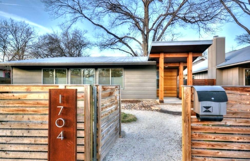
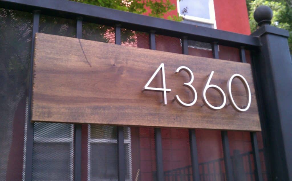
If your home is currently lacking in the curb appeal department, one easy and relatively inexpensive way to upgrade its appearance is to replace your existing house numbers with those in a mid-century modern style.
Why Replace Your Existing House Numbers With Modern House Numbers?
Here are a few reasons to consider this project:
- Style: It is hard to beat the mid-century period when it comes to polish and sophistication.
- Variety: During the mid-century period, a number of different styles flourished, getting your numerous options to choose from.
- Retro appeal: Everything retro is trending right now, so this is a great time to choose a classic look for your house numbers.
- Readability: Many mid-century typefaces are clear and easy to read even from a distance, which is important from a functional standpoint when it comes to selecting a font suitable for house numbers.
- DIY: Upgrading your house numbers is easy! You can order them online and switch them out yourself for an instant boost to your curb appeal. There are few other faster or simpler DIY home improvement projects.
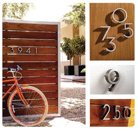
Mid-Century Modern Fonts to Consider
There are many typefaces which are suitable for a mid-century style look for your house numbers.
Here are a few popular options.
Neutra/Neutraface
The Neutra/Neutraface typeface was developed by a company called House Industries in collaboration with Dion Neutra, son of Richard Neutra.
It is an attempt at reproducing the house numbers which were used on structures that Richard Neutra designed in the 1930s. The character set also includes the letters of the alphabet, again based on those which appeared on Richard Neutra’s historical building signs.
House Industries, describing Neutraface, writes, “It is no wonder that Neutra specified lettering that was open and unobtrusive, the same characteristics which typified his progressive architecture. House Industries brings the same linear geometry to Neutraface without sacrificing an unmistakably warm and human feel.”
The numbers in this typeface are recognizable from their sleek lines and the pronounced roundness of the “0”s. For those in search of elegant art deco appeal, they are an outstanding option.
Eames Century Modern
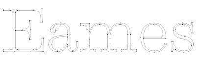
Another House Industries typeface which reproduces as closely as possible a particular historic design style is Eames Century Modern. House Industries describes the font as “a typographic workhorse that honors the Eames aesthetic while offering unprecedented functionality. An eighteen-style serif typeface family strikes an unprecedented balance between distinctive idiosyncrasies, readability and space economy.”
In many respects, this typeface is the opposite of Neutra. Whereas Neutra is sans serifs, this family does include serifs. Whereas Neutra numbers are slender and unobtrusive, the Eames Century Modern numbers are fat, exuberant and playful. If Neutra were a gazelle, Eames Century Modern would be an elephant.
Berthold Akzidenz Grotesk Bold Extended
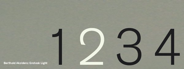
If you are in search of Eichler house numbers in the style of Joseph Leopold Eichler, the closest approximation you will find is probably the font Berthold Akzidenz Grotesk Bold Extended.
As explained here, a couple of homeowners in Sunnyvale named Leslie and Tod Fitch wanted to reproduce Eichler numbers. “The Fitches’ first step was to determine what font Eichler used. Leslie applied her graphic design expertise to the problem and evaluated a number of likely looking fonts. She created templates on a transparent film of various fonts using Quark, a page layout application (Pagemaker or Photoshop could also be used). Placing the templates over original numbers on neighboring homes, Leslie got a nearly exact match from the font, Berthold Akzidenz Grotesk Bold Extended, 239 point, which she vertically scaled to 92 percent.”
Other Options
There are so many typefaces developed in mid-century-inspired styles!
Along with the reproduction fonts above, you can scour the web to find numerous other possibilities. For example, art deco was a popular design style ranging from the 20s through the 40s (largely evolving into streamline moderne from the 30s onward).
Some typefaces which are art deco or art deco-inspired include:
- Andes
- Coventry Garden
- Betty Noir
- Metro Retro NF
- Ardeco
- Dubba Dubba NF
If you design your own house numbers and have them made for you, remember to pay for the font license.
Where to Shop for Mid-Century Style Modern House Numbers?
There are lots of places you can shop for mid-century modern house numbers. Here are a few websites you can try:
Modern Dwell Numbers
Chiasso
Modern House Numbers
Atlas Homewares
Heath Ceramics
Modplexi
House Number Lab
Another option is to search for what is available from independent sellers on Etsy.
Once you have them, you can upgrade your curb appeal in a matter of minutes. Enjoy giving the exterior of your home a more retro flavor!